Tuesday, March 10, 2020

CSR Multi-index report in python using pandas

I wanted to make a report with multi-index columns and rows using python and pandas. 

The starting point was data in Excel file. The data was brought in pandas data frame.

I wanted an output report that looked like the report shown below.

But there was one condition. The condition was the quarters of the year has to be as per Indian financial year that starts on 1st April and end on 31st March the following year. 

What helped me was the below syntax.

Q-DEC specifies quarterly periods whose last quarter ends on the last day in December. 

Q-MAR specifies quarterly periods whose last quarter ends on the last day in March.

So, I chose Q-MAR. 

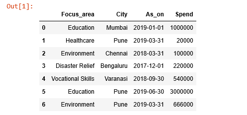
The data shown is about spend on Social and Environmental efforts of a company in India. A similar report has to be published by the company, as applicable, as per Indian laws. 

The report format can also be extended to report on financial numbers. The data itself is imaginary. 

Monday, March 2, 2020

CSR Reporting using Power BI - multi-index or nested columns and rows report

I started learning Power BI a few days ago. I downloaded Power BI desktop.

What I realized is I can bring together data from different Excel files or Tables using Data Model, analyze it and report it. The totals are done by Power BI.

The time I had spent on Data Models in MS Access came in handy.   

I used Power Query to bring the files together from folder.

Below is my first multi-index or nested columns and rows report. Power BI makes it easy to report in this way. In Power BI this is a matrix visual and is interactive.

The data is not real. Defining Calendar Table helped. The Calendar represents Indian financial year and quarters.

The next step for me is to expand it to add multiple years, other locations and other focus areas.

Once I have these building blocks in place, then the next challenge is to develop a dashboard.

Wednesday, January 29, 2020

Excel Power Query - One to many and other way round


I had a list of unicorns downloaded from internet as shown below. The Cat1 is categories column. 

Figure 1

So, for every unicorn (Company), you have one or many select investors. 

Step 1:

Using power query in Excel 2016, I filtered the list to show Indian unicorns (16 of them). This was a fairly simple operation. 

Step 2:

Then again using power query I transformed the column containing select investors (many in one cell) in to multiple rows. I got a list of every Indian unicorn against the every select investor. The total number of rows grew to become 46.

Step 3:

Further I grouped all unicorn companies on select investors to know all the Indian unicorns they have invested. But for that I had to write a small custom function to combine all the unicorns as one list against every investor from select investor column. Then the list was put in column named Custom. Now we know each investor and Indian unicorns it is investing in as shown below. 

Figure 2

So, to conclude from unicorn company with its multiple investing firms; we now have investing firm and multiple unicorns companies it is investing in.  

This kind of requirement comes often with different contexts. I am new to power query and finding its usefulness as I could do the above in minutes. Next I want to do similar output using python. 


Monday, January 20, 2020

ET top 25 - further analysis

Further to below blog, I have added a few more plots. 

A) I have added a column to dataframe to indicate if the company belongs to public (pub) sector or private (pvt) sector. The below plot (similar to the earlier blogpost) shows the plot by types of companies. 

B) I also wanted to study the distribution, so I have added a histogram. From it, we can see that most of companies are below revenue level of Rs 2,00,000 Cr (USD 28.5billion).
C) I added one more calculated column in the dataframe to show profit percentage compared to revenue in the below graph. High profits percentage companies are in private sector and are IT companies namely TCS (only company with 20% plus profit ratio) and Infosys. The other two companies are banking firms namely HDFC Bank and HDFC. The top five companies by revenue are not that profitable by the ratio of profits to revenue and most of them are public sector companies. 
The data was analyzed using python, pandas and plotted using seaborn library. 

Sunday, January 19, 2020

ET500-Raw data to pandas dataframe to charts

ET500-Raw data to pandas dataframe to charts

Recently Economic Times published ET500 – list of top 500 companies in India.

I copied the data from website for top 25 companies. It was continuous and looked like this.

There were no delimiters. Using python, I imported the file, and using re module; cleaned and separated elements in each line. Then imported these in pandas data frame. It looked as this.


The next step was to plot it. The below plot is using seaborn library.


Within these spaces the topprofit-making (Rs 30,000 Cr and above) companies are Reliance, ONGC, TCS. The next bracket of Rs 20,000 Cr and above but below Ra 30,000 Cr has HDFC Bank. Rs 15,000 Cr and above, but below the above levels have Indian Oil, HDFC and Infosys. 

Till Rs 10,000 Cr of PAT; revenue and PAT appear to go together. After that PAT level there is a lot of deviation in revenue levels. 

In my next blog I will do more analysis and visualization. 

Thursday, December 19, 2019

Cleaned category list using Python3

I analyzed an excel containing a list of 300+ #unicorns using #Python and #Pandas. I made some nice charts also. 

Later I realized that the column containing the classification values of unicorns such as TravelTech, EduTeach, Ecommerce had not been written consistently. 

These similar looking classification values were written differently. 

Ecommerce was written as eCommerce, ecommerce, e-commerce and so on.  With these classification values my analysis wasn’t right. The grouping on classification values had given me incorrect analysis. These kinds of errors are common when no data validation is in place.

So started all over again. Just to describe in this post; I have taken the values and created a list. 

The existing values are given below. 

['Auto Tech', 'AutoTech', 'Digital health', 'Digital Health', 'EdTech', 'Edtech', 'Ed Tech', 'e-commerce', 'eCommerce', 'ecommerce', 'Food & Beverage', 'Food & Beverages', 'Food and Beverage', 'Health & Wellnes', 'Health & Wellness', 'IoT', 'Internet of Things', 'Sales Tech', 'SalesTech', 'On Demand', 'On-Demand', 'On-demand', 'Supply Chain & Logistics', 'Supply chain & Logistics', 'Travel Tech', 'TravelTech']

Using Python, I cleaned the list. I used #Spyder 4.0 which is beautiful. I used good old loops in the logic. I am comfortable with loops. 

The new list is given below.

['Autotech', 'Autotech',    'Digitalhealth',    'Digitalhealth',    'Edtech',  'Edtech', 'Edtech', 'Ecommerce',    'Ecommerce',    'Ecommerce',    'Food&Beverages', 'Food&Beverages', 'Food&Beverages',    'Health&Wellness', 'Health&Wellness', 'Iot', 'Internetofthings', 'Salestech', 'Salestech', 'Ondemand', 'Ondemand', 'Ondemand', 'Supplychain&Logistics', 'Supplychain&Logistics', 'Traveltech', 'Traveltech']   

The new cleaned  list is now ready for analysis. All the classification values are written consistently. 

However, there is one more iteration I have to do. IoT and ‘Internet of Things’ are shown separately.

I hope to take care of that as well shortly. 
Saturday, November 30, 2019

Mutual Funds Performance

The diagram shows two sub plots. The left subplot shows the 5 large cap funds by their names ans assets (AUM) in rupees crores.
One way to judge a fund is by its AUM. The AUM has grown because investors have invested money it. The large AUM may overcome the sudden withdrawals by investors. 
But this is not the only way to evaluate performance of a fund. 
So on the right hand side I have plotted another chart indicating the performance (returns) of the fund over last 10 years for the regular scheme. All funds have given a return in excess of 10 per cent. 
10 years may be a good indicator to judge the performance. 
However both the parameters together may not be sufficient to evaluate performance of funds. There are other factors as well that are not considered in this post.

The data has been analyzed and plotted using Python3 and pandas. 
This time I imported .xls file in to pandas for analysis. 
The source of the data is https://www.amfiindia.com

Disclaimer: This post is not a suggestion or advice to invest in any particular mutual fund. Please contact your investor advisor for it.